![[Image: uOxmXw8.png]](https://i.imgur.com/uOxmXw8.png)
![[Image: ZN9DnV0.png]](https://i.imgur.com/ZN9DnV0.png)
![[Image: Pu9shLU.png]](https://i.imgur.com/Pu9shLU.png)
![[Image: brooks.png]](https://i.ibb.co/JW13P77m/brooks.png)

|
Offline 
That’s dope! Still waiting on mine lol.
![[Image: 61035_s.gif]](https://signavatar.com/61035_s.gif) [OPTION]===========================================
[option]Season Stats
[OPTION]===========================================
[option]Season Stats - MVP - QBOTY - 1st Team Pro Bowl [OPTION]===========================================
[option]Season Stats - 2nd Team Pro Bowl
[OPTION]===========================================
[option]S23 - London Royals [option]|Completions: 274 [OPTION]===========================================
[option]S22 - London Royals [option]|Completions: 168 [option]|S26 Ultimus Champion
[option]|S26 ISFL Quarterback of the Year
[option]|S26 ISFL MVP
[option]|S26 1st Team Pro Bowl QB
[option]|S26 Fantasy Points Leader
[option]|S27 2nd Team Pro Bowl
[option]|S28 Ultimus Champion
[option]|S28 2nd Team Pro Bowl
[option]|Set Single Season Passing Record - S29 - 5758 Yards
[option]|S29 ISFL Quarterback of the Year
[option]|S29 ISFL MVP [option]|S29 1st Team Pro Bowl QB [OPTION]Lightsout Lewis | Safety | YK Wraiths | 1124 TPE
[OPTION]Height: 6'2"
[OPTION]Weight: 215
[OPTION]Birthplace: Laurel, Idaho
[OPTION]Number: 32
[OPTION]===========================================
[option]Season Stats
[option]|Touchdowns: 1
[/div]
[option]Season Stats
[option]|Pass Deflections: 12
[option]S18 - Yellowknife Wraiths - 1st Team Pro Bowl
[option]|Pass Deflections: 13
[option]S17 - Chicago Butchers - 1st Team Pro Bowl
[option]|Pass Deflections: 18
[option]S16 - Chicago Butchers (Moved to Safety)
[option]|Pass Deflections: 9
[option]S15 - Kansas City Coyotes
[option]|Tackles: 180
[option]|Pass Deflections: 4
[option]|Blocked Punts: 1
[option]S14 - Portland Pythons/Kansas City Coyotes
[option]|Tackles: 63
[option]|Pass Deflections: 3
[OPTION]===========================================
[OPTION]Trophy Case/Achievements:
[OPTION]S14 DSFL Draft: Round 6 - 33rd Overall
[OPTION]S14 DSFL Pro Bowl Reserve - LB
[OPTION]S15 NSFL Draft: Round 1 - 6th ovr
[OPTION]S15 DSFL Pro Bowl Starter - LB
[OPTION]S16 NSFL Pro Bowl Reserve - S
[OPTION]S17 NSFL Pro Bowl Starter - S
[OPTION]S18 NSFL Pro Bowl Starter - S
[OPTION]S19 NSFL Pro Bowl Starter - S
[OPTION]S20 NSFL Pro Bowl Starter - S
Offline
Haha it’s all good.
Yeah Eric Weddle, #32, Lightsout Lewis and obviously your teammate on the Wraiths lol [OPTION]===========================================
[option]Season Stats
[OPTION]===========================================
[option]Season Stats - MVP - QBOTY - 1st Team Pro Bowl [OPTION]===========================================
[option]Season Stats - 2nd Team Pro Bowl
[OPTION]===========================================
[option]S23 - London Royals [option]|Completions: 274 [OPTION]===========================================
[option]S22 - London Royals [option]|Completions: 168 [option]|S26 Ultimus Champion
[option]|S26 ISFL Quarterback of the Year
[option]|S26 ISFL MVP
[option]|S26 1st Team Pro Bowl QB
[option]|S26 Fantasy Points Leader
[option]|S27 2nd Team Pro Bowl
[option]|S28 Ultimus Champion
[option]|S28 2nd Team Pro Bowl
[option]|Set Single Season Passing Record - S29 - 5758 Yards
[option]|S29 ISFL Quarterback of the Year
[option]|S29 ISFL MVP [option]|S29 1st Team Pro Bowl QB [OPTION]Lightsout Lewis | Safety | YK Wraiths | 1124 TPE
[OPTION]Height: 6'2"
[OPTION]Weight: 215
[OPTION]Birthplace: Laurel, Idaho
[OPTION]Number: 32
[OPTION]===========================================
[option]Season Stats
[option]|Touchdowns: 1
[/div]
[option]Season Stats
[option]|Pass Deflections: 12
[option]S18 - Yellowknife Wraiths - 1st Team Pro Bowl
[option]|Pass Deflections: 13
[option]S17 - Chicago Butchers - 1st Team Pro Bowl
[option]|Pass Deflections: 18
[option]S16 - Chicago Butchers (Moved to Safety)
[option]|Pass Deflections: 9
[option]S15 - Kansas City Coyotes
[option]|Tackles: 180
[option]|Pass Deflections: 4
[option]|Blocked Punts: 1
[option]S14 - Portland Pythons/Kansas City Coyotes
[option]|Tackles: 63
[option]|Pass Deflections: 3
[OPTION]===========================================
[OPTION]Trophy Case/Achievements:
[OPTION]S14 DSFL Draft: Round 6 - 33rd Overall
[OPTION]S14 DSFL Pro Bowl Reserve - LB
[OPTION]S15 NSFL Draft: Round 1 - 6th ovr
[OPTION]S15 DSFL Pro Bowl Starter - LB
[OPTION]S16 NSFL Pro Bowl Reserve - S
[OPTION]S17 NSFL Pro Bowl Starter - S
[OPTION]S18 NSFL Pro Bowl Starter - S
[OPTION]S19 NSFL Pro Bowl Starter - S
[OPTION]S20 NSFL Pro Bowl Starter - S
Offline
1 and 2: 4 (2 x 1m = 2m) Both pretty strong contenders, I felt, out of the two, Gordon was stronger. I think Lewis's render had the least done and the background doesnt do a lot. However it is very strong font wise. Whats holding Gordon back the most is your light effect (i.e the rays). Taking them off the face will do wonders for the sig. I will point out the lightening effect is nice, but I would have liked it the light coming off of it to hit the render.
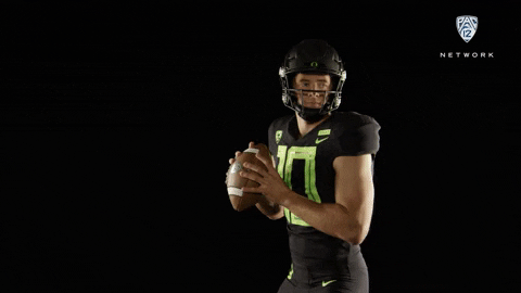
3: 4.5/5 1.25m Honestly this is pretty perfect. I think you have a few issues holding it back. One is the glaring cut off on the shadows around the left arm. Typically happens when you do the effect near an edge. The name swap is nice. It does look apparent when you tak into account it doesn't follow the folds or shadows, and your helmet logo swap doesn't look to curve with the helmet which is noticeable since the helmet is a focal point in the sig. I think the "Warp Transform" tool can alleviate this in Gimp but I didn't take points off for that to be honest, nor did anyone else mention that. Also your lens flare placement is pretty on point. Total Payout: 3.25m |
|
|


![[Image: IMG_4308.jpg]](https://cdn.discordapp.com/attachments/773268613532221452/929252111747801139/IMG_4308.jpg)
